Components
A component is a single building block within a flow and consists of inputs, outputs, and parameters that define its functionality.
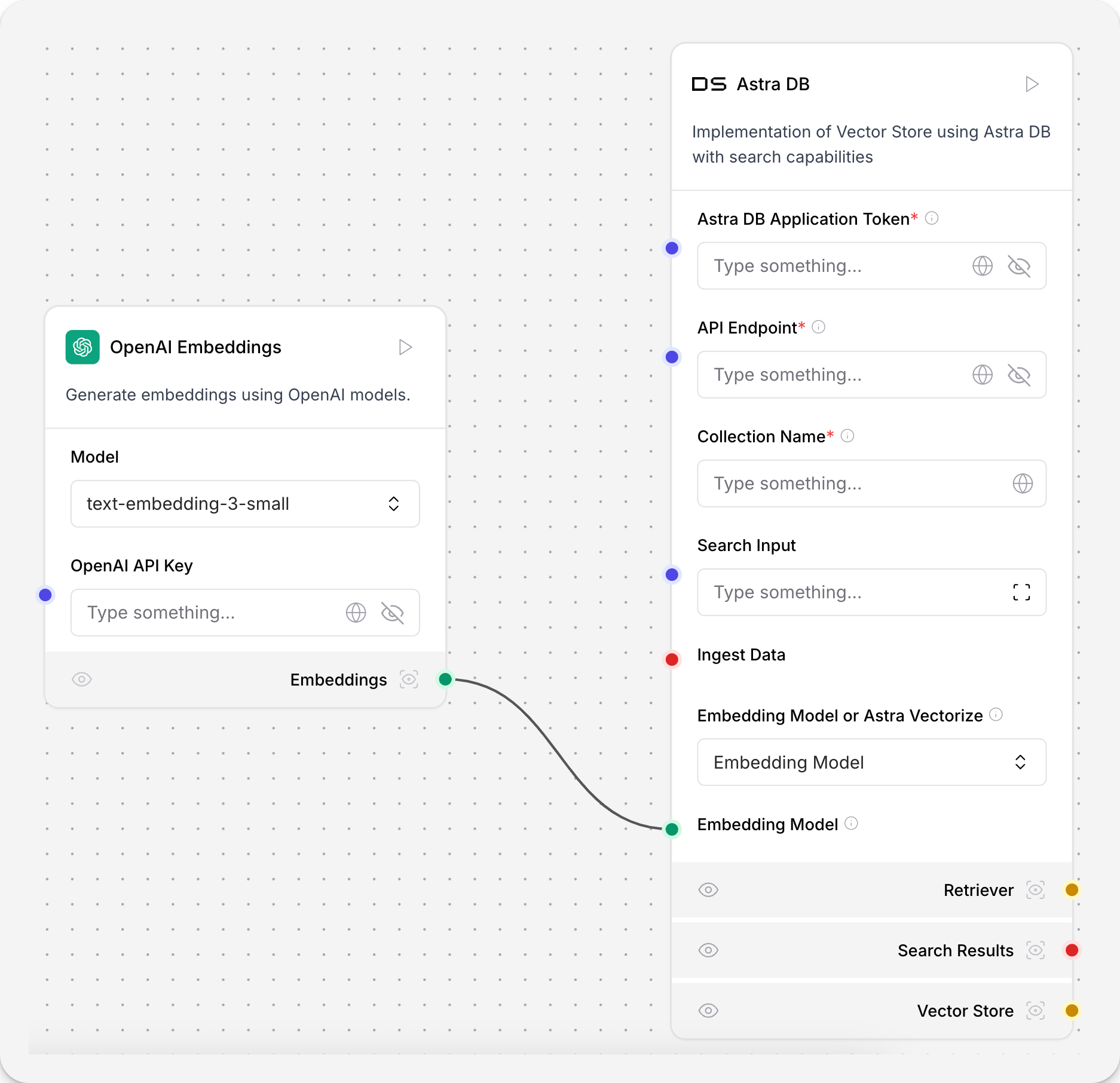
The handles () on the side of a component indicate the types of inputs and outputs that can be connected at that port. Hover over a handle to see connection details.
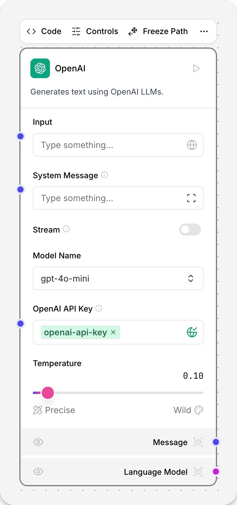
Click the to preview a component’s output.
To run a single component, click Play. A Check indicates that the component ran successfully.
To run the entire flow, click Playground.
Component handles
Handles () on the side of a component indicate the types of inputs and outputs that can be connected at that port. Hover over a handle to see connection details.
Click a handle to sort the component menu by compatibility.
Handles with matching colors typically indicate that you can connect those ports. For example, a green handle means Embeddings. You can connect a green output handle to a green input handle to pass embeddings data between components.
The following table lists the handle colors and their corresponding data types:
| Data Type | Handle Color |
|---|---|
BaseLanguageModel |
Fuchsia handle |
Data |
Red handle |
Document |
Lime handle |
Embeddings |
Emerald handle |
LanguageModel |
Fuchsia handle |
Message |
Indigo handle |
Prompt |
Violet handle |
str |
Indigo handle |
Text |
Indigo handle |
unknown |
Gray handle |
Component menu
Use the component controls to do the following:
-
Code: Modify and save component code.
-
Advanced Settings: Modify parameters for the component.
-
Freeze Path: After a component runs, lock its previous output state to prevent it from re-running.
Click to see additional options for a component.
To view a component’s output and logs, click the icon.
To run a single component, click Play. A Check indicates that the component ran successfully.
Running a single component with the Play button is different from running the entire flow with the Playground.
In a single component run, the build_vertex function is called, which builds and runs only the single component with direct inputs provided through the UI (the inputs_dict parameter). The VertexBuildResult data is passed to the build_and_run method, which calls the component’s build method and runs it. Unlike running the full flow, running a single component does not automatically execute its upstream dependencies.
Component code
Click the Code button to view and edit the Python code for a component.
Click Check & Save to save your changes.
A validation check runs to ensure that the new code is correct.
A component inherits from a base Component class that defines its interface and behavior.
For example, the Recursive character text splitter is a child of the LCTextSplitterComponent class.
Recursive character text splitter component code
from typing import Any

from langchain_text_splitters import RecursiveCharacterTextSplitter, TextSplitter

from langflow.base.textsplitters.model import LCTextSplitterComponent
from langflow.inputs.inputs import DataInput, IntInput, MessageTextInput
from langflow.utils.util import unescape_string

class RecursiveCharacterTextSplitterComponent(LCTextSplitterComponent):
    display_name: str = "Recursive Character Text Splitter"
    description: str = "Split text trying to keep all related text together."
    documentation: str = "https://docs.langflow.org/components-processing"
    name = "RecursiveCharacterTextSplitter"
    icon = "LangChain"

    inputs = [
        IntInput(
            name="chunk_size",
            display_name="Chunk Size",
            info="The maximum length of each chunk.",
            value=1000,
        ),
        IntInput(
            name="chunk_overlap",
            display_name="Chunk Overlap",
            info="The amount of overlap between chunks.",
            value=200,
        ),
        DataInput(
            name="data_input",
            display_name="Input",
            info="The texts to split.",
            input_types=["Document", "Data"],
        ),
        MessageTextInput(
            name="separators",
            display_name="Separators",
            info='The characters to split on.\nIf left empty defaults to ["\\n\\n", "\\n", " ", ""].',
            is_list=True,
        ),
    ]

    def get_data_input(self) -> Any:
        return self.data_input

    def build_text_splitter(self) -> TextSplitter:
        if not self.separators:
            separators: list[str] | None = None
        else:
            # check if the separators list has escaped characters
            # if there are escaped characters, unescape them
            separators = [unescape_string(x) for x in self.separators]

        return RecursiveCharacterTextSplitter(
            separators=separators,
            chunk_size=self.chunk_size,
            chunk_overlap=self.chunk_overlap,
        )
Components include definitions for inputs and outputs, which are represented in the UI with color-coded ports, called handles ().
Input Definition: Each input specifies an input’s type, name, and display properties, which appear as configurable fields in the component’s UI panel. The RecursiveCharacterTextSplitterComponent has four inputs: IntInput, DataInput, and MessageTextInput. The IntInput inputs are for the chunk size and overlap, and the DataInput input is for the text data to be split. The MessageTextInput input is for the separators to split on.
Methods: Components have methods or functions that handle their functionality. The RecursiveCharacterTextSplitterComponent has two methods. get_data_input retrieves the text data to be split from the component’s input. This makes the data available to the class. build_text_splitter `creates a `RecursiveCharacterTextSplitter object by calling its parent class’s build method. The text is split with the created splitter and passed to the next component. When used in a flow, this component does the following:
-
Displays its configuration options in the UI.
-
Validates user inputs based on the input types.
-
Processes data using the configured parameters.
-
Passes results to the next component.
Freeze path
After a component runs, Freeze Path locks the component’s previous output state to prevent it from re-running.
If you’re expecting consistent output from a component and don’t need to re-run it, click Freeze Path.
Enabling Freeze Path freezes all components upstream of the selected component.
If you only want to freeze a single component, select Freeze instead.
A icon appears on all frozen components.
Additional component options
Click to see additional options for a component.
To modify a component’s name or description, double-click in the Name or Description fields. Component descriptions accept Markdown syntax.
Component keyboard shortcuts
The following keyboard shortcuts are available when a component is selected.
| Menu item | Windows shortcut | Mac shortcut | Description |
|---|---|---|---|
Code |
Space |
Space |
Opens the code editor for the component. |
Advanced Settings |
Ctrl + Shift + A |
⌘ + Shift + A |
Opens advanced settings for the component. |
Save Changes |
Ctrl + S |
⌘ + S |
Saves changes to the current flow. |
Save Component |
Ctrl + Alt + S |
⌘ + Alt + S |
Saves the current component to Saved components. |
Duplicate |
Ctrl + D |
⌘ + D |
Creates a duplicate of the component. |
Copy |
Ctrl + C |
⌘ + C |
Copies the selected component. |
Cut |
Ctrl + X |
⌘ + X |
Cuts the selected component. |
Paste |
Ctrl + V |
⌘ + V |
Pastes the copied/cut component. |
Docs |
Ctrl + Shift + D |
⌘ + Shift + D |
Opens related documentation. |
Minimize |
Ctrl + . |
⌘ + . |
Minimizes the current component. |
Freeze |
Ctrl + F |
⌘ + F |
Freezes the current component state. |
Freeze Path |
Ctrl + Shift + F |
⌘ + Shift + F |
Freezes component state and upstream components. |
Download |
Ctrl + J |
⌘ + J |
Downloads the component as JSON. |
Delete |
Backspace |
Backspace |
Deletes the component. |
Group |
Ctrl + G |
⌘ + G |
Groups selected components. |
Undo |
Ctrl + Z |
⌘ + Z |
Reverses the last action. |
Redo |
Ctrl + Y |
⌘ + Y |
Repeats the last undone action. |
Redo (alternative) |
Ctrl + Shift + Z |
⌘ + Shift + Z |
Alternative shortcut for redo. |
Share Component |
Ctrl + Shift + S |
⌘ + Shift + S |
Shares the component. |
Share Flow |
Ctrl + Shift + B |
⌘ + Shift + B |
Shares the entire flow. |
Toggle Sidebar |
Ctrl + B |
⌘ + B |
Shows/hides the sidebar. |
Search Components |
/ |
/ |
Focuses the component search bar. |
Tool Mode |
Ctrl + Shift + M |
⌘ + Shift + M |
Toggles tool mode. |
Update |
Ctrl + U |
⌘ + U |
Updates the component. |
Open Playground |
Ctrl + K |
⌘ + K |
Opens the playground. |
Output Inspection |
O |
O |
Opens output inspection. |
Play |
P |
P |
Plays/executes the flow. |
API |
R |
R |
Opens the API view. |
Group multiple components
Multiple components can be grouped into a single component for reuse. Combine large flows into single components (like RAG with a vector database, for example) to save space.
-
Hold Shift and drag to select the components to be grouped.
-
Select Group. The components merge into a single component.
-
Double-click the name and description to rename them.
-
Save your grouped component to the sidebar for later use.
Save a component
-
Click All and select Save. Your component is saved in the sidebar for later use.
-
To use the component in another flow, drag it from the sidebar to the workspace.
Update a component version
A component’s initial state is stored in a database. As soon as you drag a component from the sidebar to the workspace, the two components are no longer in parity.
A component keeps the version number it is initialized to the workspace with. If a component is at version 1.0 when it is dragged to the workspace, it will stay at version 1.0 until you update it.
Langflow notifies you when a component’s workspace version is behind the database version and an update is available. Click the Update Component icon to update the component to the latest version. This will change the code of the component in place so you can validate that the component was updated by checking its Python code before and after updating it.
Components sidebar
Components are listed in the sidebar by component type.
Component bundles are components grouped by provider. For example, Langchain modules like RunnableExecutor and CharacterTextSplitter are grouped under the Langchain bundle.
The sidebar includes a component Search bar, and includes flags for showing or hiding Beta and Legacy components.
Beta components are still being tested and are not suitable for production workloads.
Legacy components are available to use but may not work due to Langflow core updates.
